UK Madness Level Turned To 11: Coronavirus Upate XLVIII
THE UK
https://twitter.com/Albion_Rover/status/1348600356754903040
I said last week "The UK has lost its mind." They have moved to Madness Level 11 since then, proposing allowing people outside only once per week, and arresting now those walking alone along the beach.
The scientists in charge of the UK are a word I cannot use on a family blog. They are also not too good at their jobs, which I can say, and which I can prove with ease.
Here are two plots, using data from their own ONS (here and here), that prove their scientists are idiots.
The first is the weekly all-cause death from 1993 to the end of 2020 (the last update they had available when I downloaded the data on the weekend):
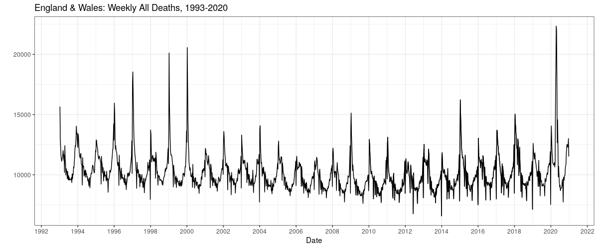
The coronadoom and lockdowns, with the two battling it out for top body count, did indeed kill a lot of people in early 2020. The number of dead (by whatever cause) since then has been less than many, many, many other years.
Here is the same data per capita, which puts the madness in better perspective.
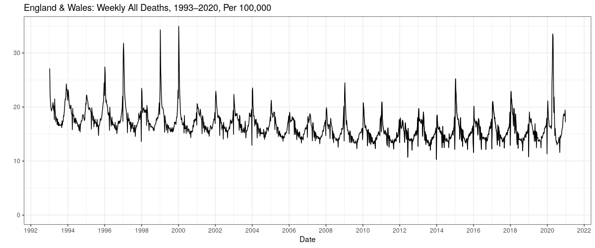
The flu+pneumonia seasons of both 1999 and 2000 were worse than the doom in 2020.
Where by worse I mean worse.
There is no justification for turning the screws on citizens. So why do they do it? Models. Models have taken the place of Reality. I have been warning about this for many years. It's time you listened.
BOOK UPDATE
The book is back in stock! The Price of Panic.
The price is still $12.99 for the hardback. You can't afford not to buy.
Incidentally, all our predictions have come true.
Website of similar name: price of panic.
THE NUMBERS
Sources: daily tests, CDC official toll number one, number two (the old weekly file, now suspect). Deaths by age. Covid & flu. WHO flu tracker. All current as of Monday night.
I believe the same kind of per capita all-cause death figure for the UK holds for the US in spirit, but I have been unable to find monthly all-cause death data for the US before late 2009. If anybody knows of it, please drop me a note.
CDC weekly ALL CAUSE death counts, or the Perspective Plot, from late 2009 until now. The late drop off is late counting: it takes up to eight weeks to get all data, but most are in by three. We need to look at all cause deaths because we can't quite trust the attributed COVID numbers.
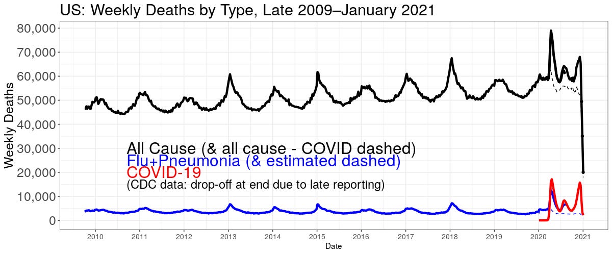
The black line is deaths of any kind. The red COVID. The blue line is flu+pneumonia (it's the pneumonia that kills most flu patients). The blue is estimated starting mid year because CDC stopped separate reporting on flu. The suspicion is some flu and pneumonia deaths are being attributed to COVID.
This is a little odd this week because there is a "week 53"; the CDC finally update the COVID page to include January 2020, but it doesn't start on the first, and the last week of December 2020 didn't end on the 31, but a couple of days into January 2021, which are included as the last week of 2020. Dates are always a pain in the keister.
DEATHS ALWAYS PEAK IN MID JANUARY. DO NOT BE ALARMED. PLEASE PASS THIS INFORMATION ON!
Here is the CDC deaths "involving" COVID. To prove the point just made:
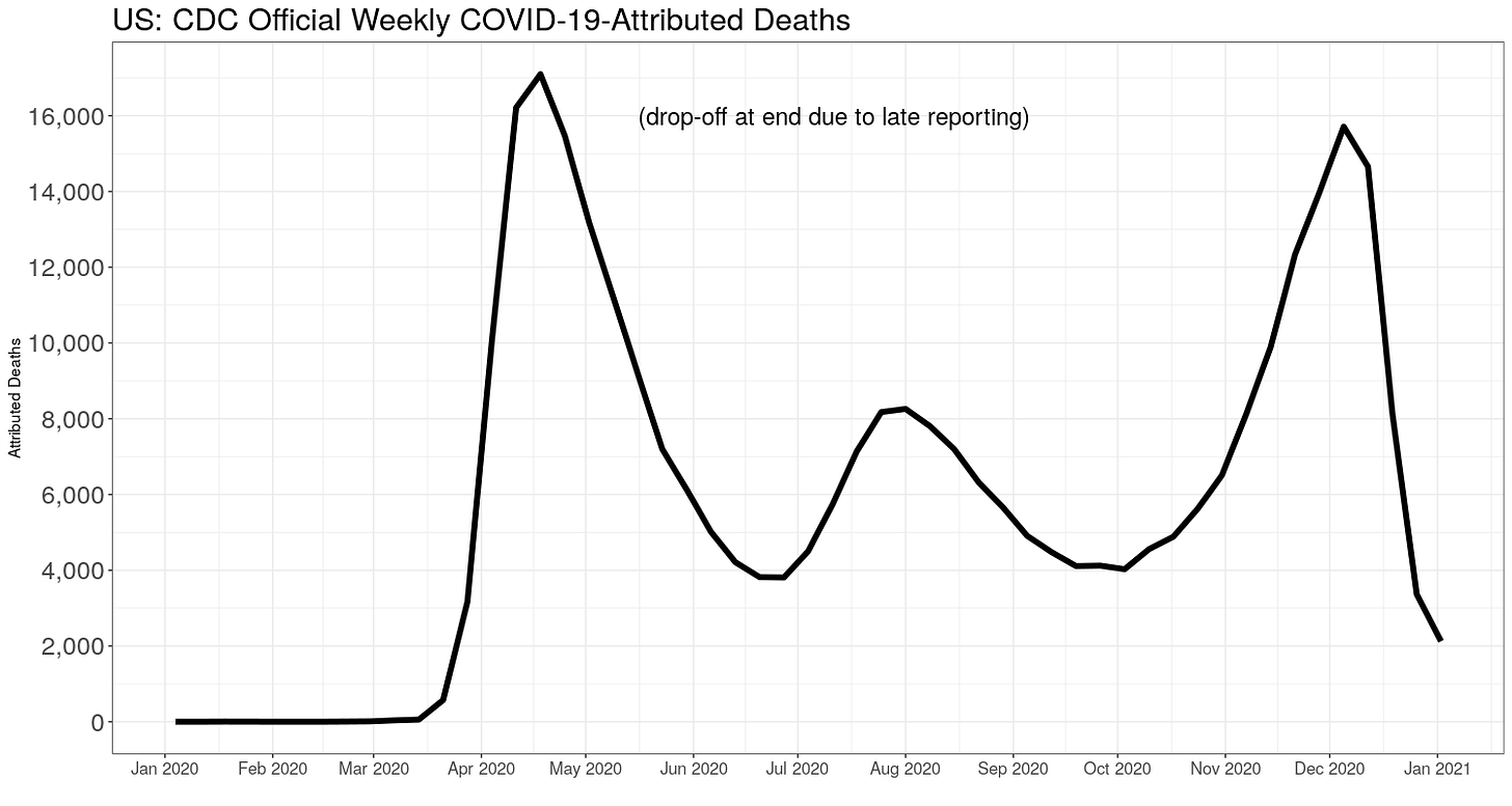
There is nothing in that to indicate any level of panic.
The January peaks are caused when we enter our voluntary lockdowns in winter, spreading bugs. This is also the "solution" governments hit upon to stop the spread of bugs. Lockdowns kill.
Besides the increasing deaths due to population increase, notice that about every other year deaths are higher. Like this winter.
Here is another way to look at all deaths, the week-of-the-year all-cause deaths.
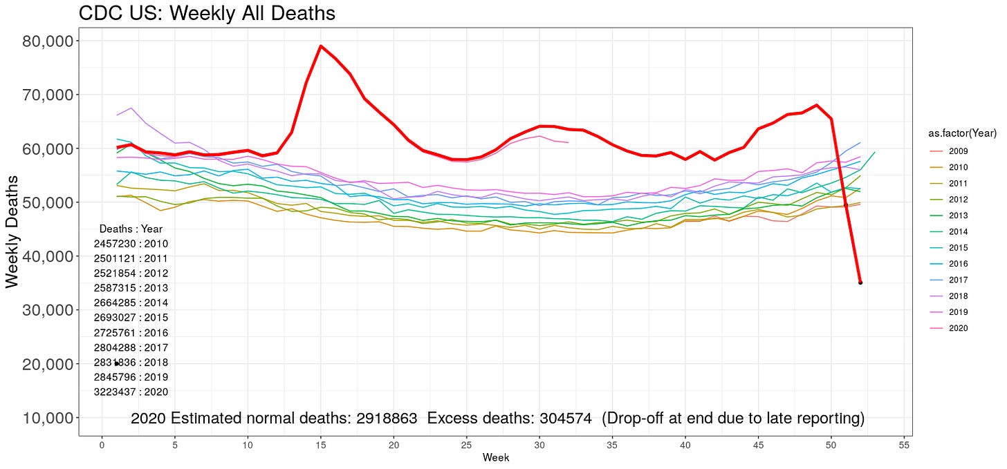
The number of deaths for each year are also given. My simple "excess" deaths model, a year-on-year extrapolation, predicted 2.92 million deaths for 2020 absent COVID. So far, there have been 3.22 million registered deaths in 2020. This gives 305 thousand "excess" deaths for 2020.
Again, so far. Once the late counting comes in, this number will grow somewhat, so be ready for that. IMPORTANT: these are not all COVID deaths! They include deaths from the "solution" to COVID, too. Plus increased suicides, cancers, heart attacks, and everything else due to lockdowns.
Daily tests:
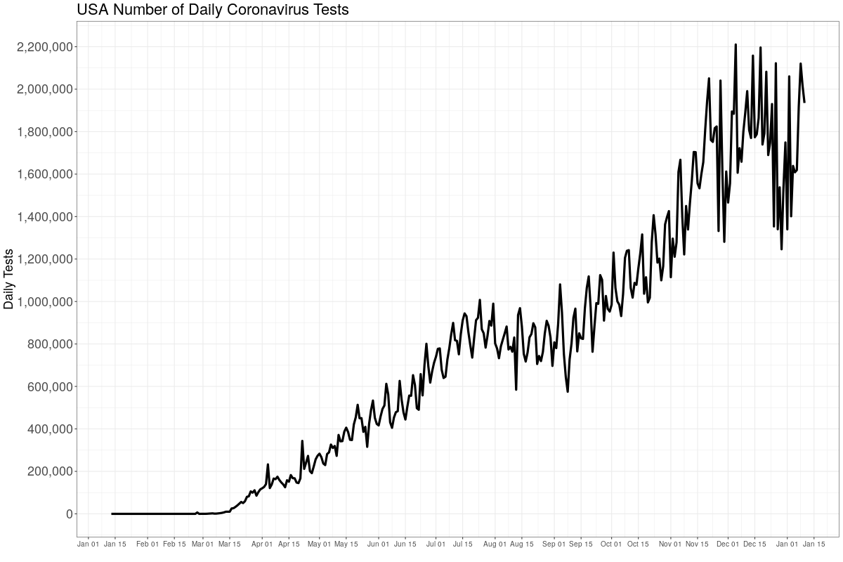
This is the number of daily tests. Each positive test in the media is counted as a new "case". These are almost all not cases, but merely positive tests, which indicate past infections, current by mild infections, asymptomatic infections, and even no infections at all. False positives.
Testing has peaked back up after the holidays, as expected. After "Death is coming" is inaugurated, it's likely to go higher still. Testing helps sustain the panic, because of all the false reporting on "cases". Again, flu is still missing. CDC found one pediatric death for flu this year. Here is the WHO's global flu tracker, which still shows flu has gone missing everywhere:
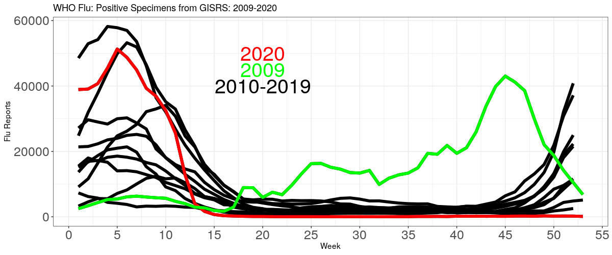
If we focus only on COVID deaths, we lose all perspective. We can see above that deaths peak every January, because of our self-enforced wintertime lockdowns, when we all hunker down inside and spread bugs among ourselves.
Here is the CDC official population mortality rates for the all causes other than COVID, and "involving" COVID (with and of; "involving" is CDC's word).
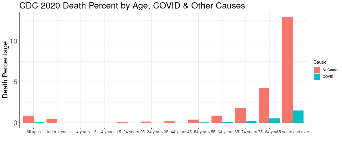
Here are the same population fatality rates in tabular form:
POPULATION FATALITY RATES
                 Age     COVID OtherCause
1       Under 1 year 0.0000085    0.00470
2          1–4 years 0.0000012    0.00021
3         5–14 years 0.0000013    0.00013
4        15–24 years 0.0000120    0.00078
5        25–34 years 0.0000460    0.00150
6        35–44 years 0.0001300    0.00220
7        45–54 years 0.0003700    0.00400
8        55–64 years 0.0008800    0.00880
9        65–74 years 0.0021000    0.01800
10       75–84 years 0.0054000    0.04300
11 85 years and over 0.0150000    0.13000
No matter what age, there is at least about a 10 times or larger chance of dying from something else then COVID. If you're under 44, the COVID risk is vanishingly low. Our level of fear is in not in line with the actual risk.
About masks in depth, see this article and this one. I am also working on a comprehensive article about masks. Hint: they do not work.
To support this site and its wholly independent host using credit card or PayPal (in any amount) click here

