It's been a while since we looked at all-cause deaths (some of this is for the new readers). This is the one statistic that can't be cooked or juiced; or not easily, anyway.
We can't trust entirely attributed coronadoom deaths. These are, as we have seen, too easy to boost. We certainly must not trust models that claim doom deaths have been underestimated. It's not that it was impossible for a death to be incorrectly categorized as other than the doom, but given the inflamed climate, financial incentives to hospitals, and idiot levels of testing, the chance is low. Plus we cannot trust those who ever want to scream IT'S WORSE THAN WE THOUGHT!
The CDC collects counts, by age, of all deaths, and tries to categorize the causes. Because of the disparate state sources, collection happens slowly. It takes on average 8 weeks to get about 80%-90% of all counts, and a few months more to get all.
So whenever we look at the numbers, we have to recall the drop offs at the end are expected.
Now what we mustn't do is, when we see the odd looking bumps in the all-cause data, to attribute all these to the doom itself. Mixed in with actual covid deaths are government "solution" deaths, like those (of whatever non-zero size) caused by vaccines. Or those caused by foolishly aggressive treatment. Or even those cause by despair and lack of access to hospitals for other diseases.
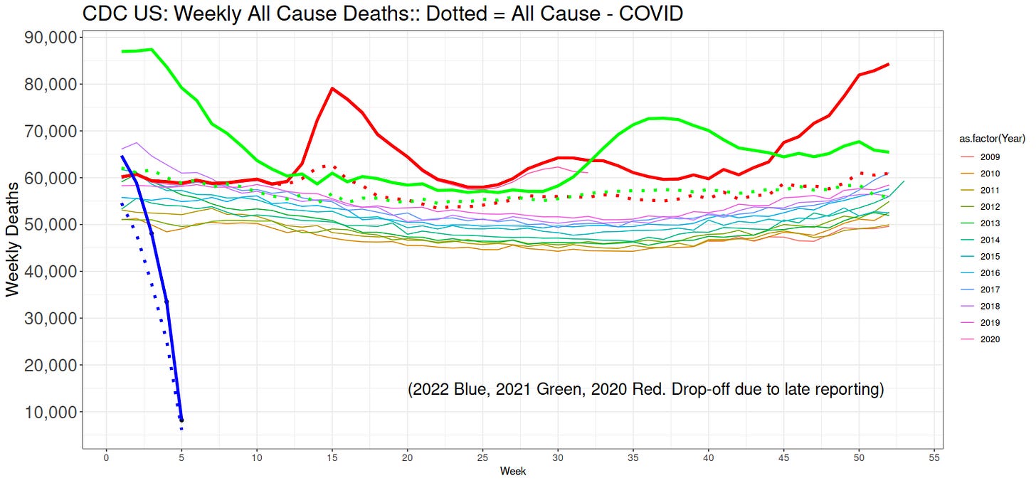
Here we go, then, the all cause weekly deaths since 2009 until Monday evening:
The thin lines are the years 2009 until early 2020, using the old way CDC used to count. They stopped that old way mid way through 2020, sometime after they signed some sort of contract with Microsoft (I believe), and they changed all their collection pages.
You can see a steady upward progression of the thin lines. This is caused by population increases in the USA. The thin purple line at Week 1 was the count for 2019. 2018-2019 was known as a harsh flu season---not remembered now, because there was no panic.
The thick red line is 2020. Notice very carefully that it was lower than we might have expected, until about Week 13, given the general upward trend of the numbers. It's gruesome, but it means more were available to die than usual come the spring of 2020.
The panic was already well under way by Week 13 (end of March). The panic did nothing to stop the rise in doom deaths, which had just then started. This is the first of many lessons of history we ignore: Panic is stupid. Panic is effeminate. Panic kills.
If it were an "ordinary" year, with deaths being caused in the same kinds of ways as previous years, we'd expect thick red line to be, more or less, just above the other thin lines. It wasn't, it was much higher so that we know something has changed in the causes of death.
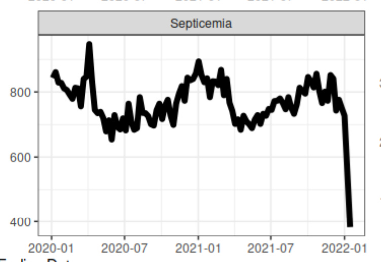
Part of that was certainly the doom itself. Part of it was "solutions." Septicemia deaths, for instance, saw a huge spike centered around April 2020. This was likely caused by ventilator panic ("General Motors! Stop making cars and make ventilators!"), which saw too many covid patients have tubes crammed down their throats by nervous, uh, doctors.
Look back the weekly all cause deaths. The dotted red line is the red line itself subtracting the official attributed covid deaths. The dotted line, in other words, are all deaths except covid.
Well, you can see that the dotted line is still a bit higher than just above the thin ones for parts of the year. Especially in the spring of 2020. The difference between the dotted line and where we might have seen it just above the thin ones represent deaths caused by something other than the doom.
Like government "solutions". Like people being told to stay away from hospitals and denied, inter alia, cancer treatments. Or by drugs, prescribed and otherwise. Lockdowns. And so on. Panic kills.
The doom hit the north in spring 2020, and the south in summer 2020. But it faded a bit in the fall of 2020. A time when there was no vaccines. This proves there are other cures beside vaccines.
Anyway, it goes on. Green is 2021. At the beginning of the year, the dotted green lines are way below where would expect them. Which is just above the thin lines, roughly. This indicates, very likely, covid deaths were being over-attributed. And for a long time, too.
But then something else entered the system round about late spring, and into summer 2021. That dotted green line is too high. It could be the same causes that led to the dotted red line being too high. Maybe not, though. 2020 was the Year of the Lockdown, not 2021. Many cast out of work, businesses, livelihoods, and homes lost.
It was something different in 2021. Can you think of what it might be? Put your minds to solving this conundrum.
Sometime in the fall and into winter, the dotted green settled down to where we'd expect it, if it were a thin line. Whatever that something different was, it had cooled off by then. Funny, yes?
And that's about as far as we can go. The blue is 2022, which looks low, but recall this is likely due to slow counting. However, even the thick green line at the end of 2021 was not that high, and it's not likely the blue line will jump up.
Which means the all-cause deaths are likely where we'd expect them in a normal year.
In other words, there does not exist in this data any justification for panic.
People are still dying of the doom, just as they are, after two long years, dying of flu again. But they are also dying of cancer and heart disease at higher rates.
With no panic about those more important causes of death.
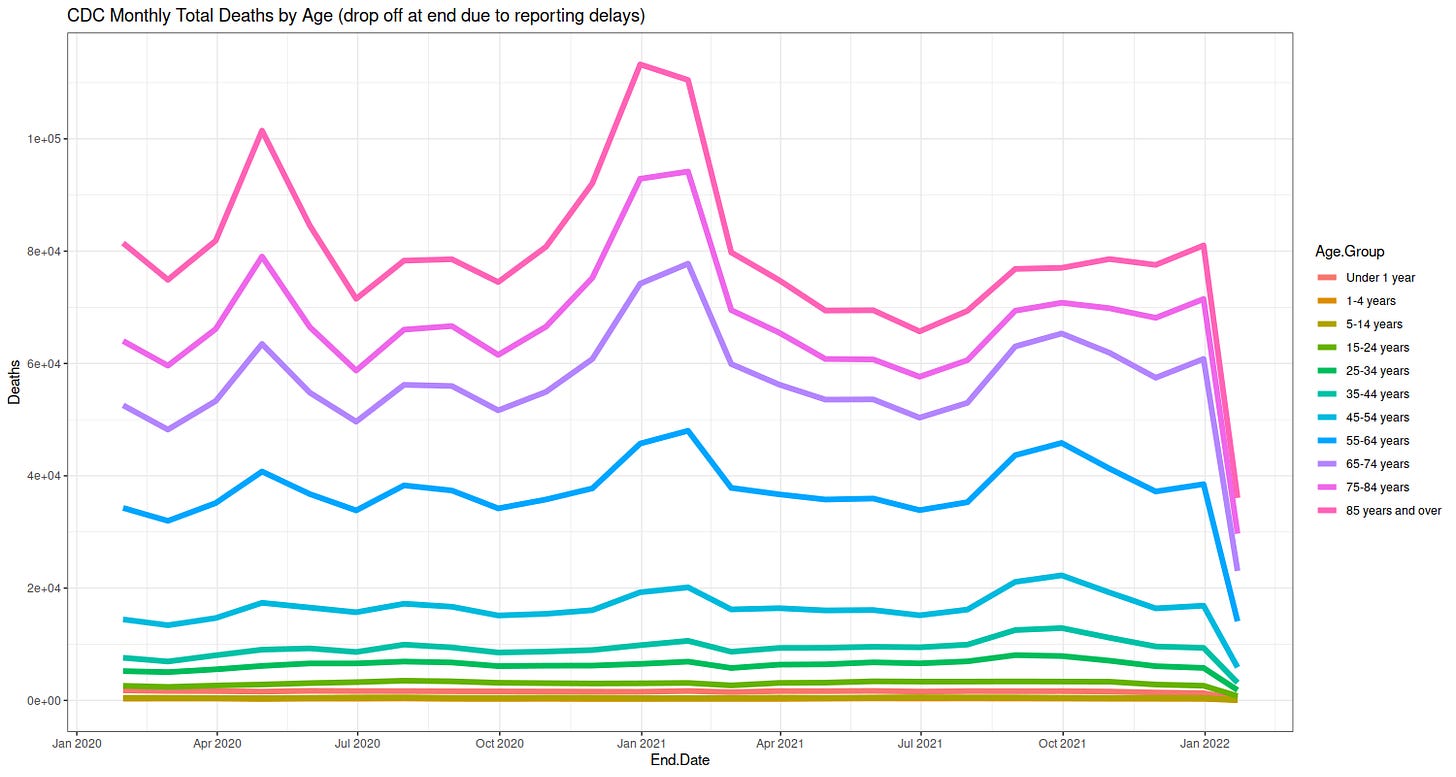
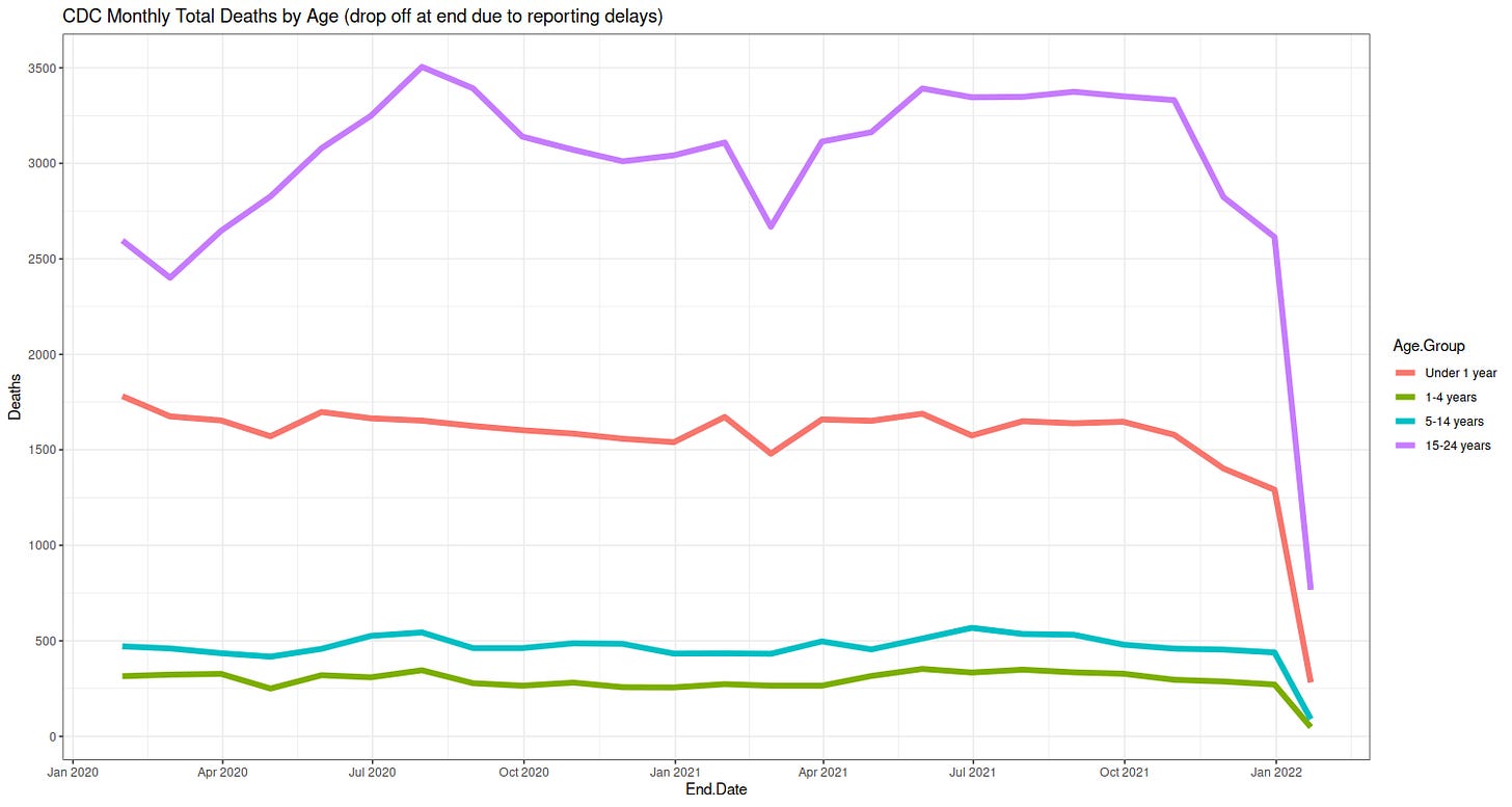
Here the same all cause deaths, but now monthly and broken down by age.
The doom was, and remains, an old person's disease. There was never any reason to panic for those under 60 or so. There is still no reason. There was reason to have special care of the elderly and infirm, but not for anybody else. More kids die of pneumonia and about ten times as many die of car crashes. With no moral panic about cars.
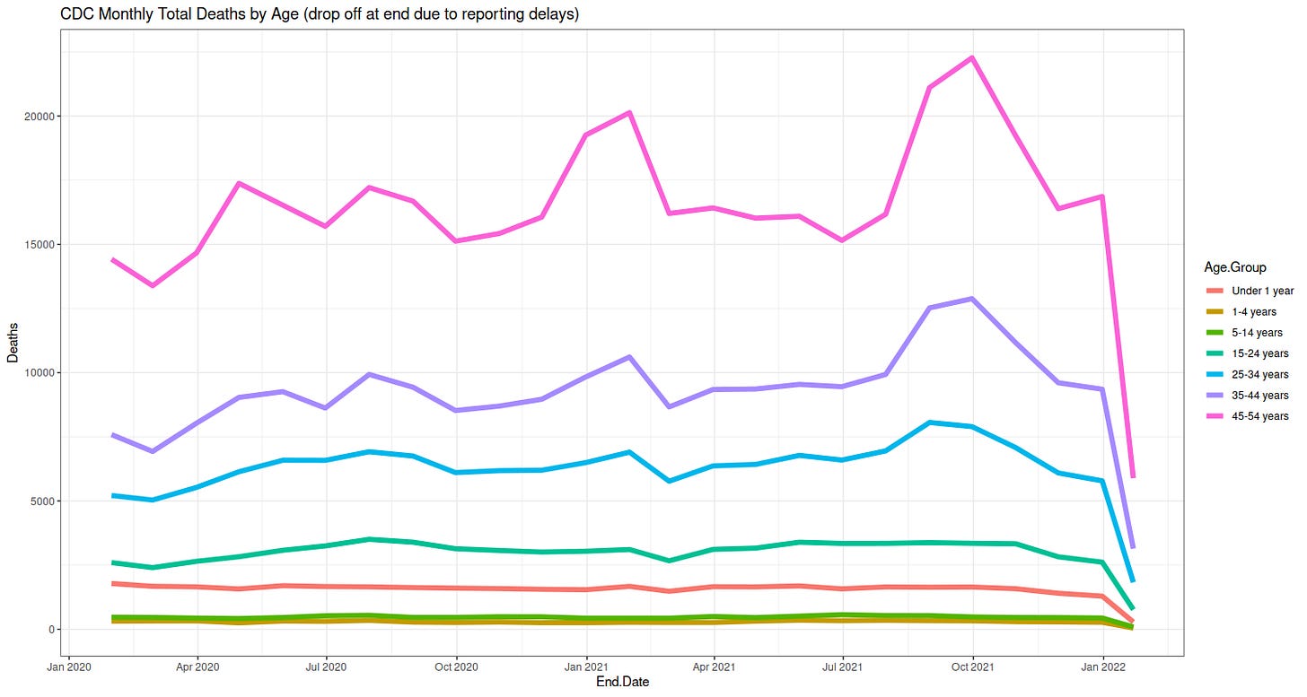
Interestingly, the second picture shows a peak in deaths for those 45-54 years in the late summer early fall 2021; and a similar but smaller signal for 35-44 year olds, and smaller yet or 25-34 year olds.
Could have been the doom. But if it was, it was worse than the alpha variant, which was in the winter of 2020. Not likelym then. Could be the end of the delta, before the omicron. Or it could have been that something else we saw above, which was aggressively seeking out these ages. What was this something else?
The last plot shows the youngest, those under 24, had no special increase in deaths. Except possibly the 15-24 year olds. Something hit then in the spring of 2021. And remained kind of steady, up until even the rise of the omicron.
Any ideas what this curious cause might be?
Incidentally, the ominous omicron peaked about two weeks ago. Infections are down from their high, and heading lower. Deaths have just started dropping from their winter peak. As regular readers expected. And which we predicted months ago.
I repeat: There is nothing in the data to justify continuing the panic. Just as there is never any reason to panic.
Buy my new book and own your enemies: Everything You Believe Is Wrong.
Visit me at my blog, wmbriggs.com.


