How To Generate Massive Scientific Over-Certainty With These Four Simple Tricks
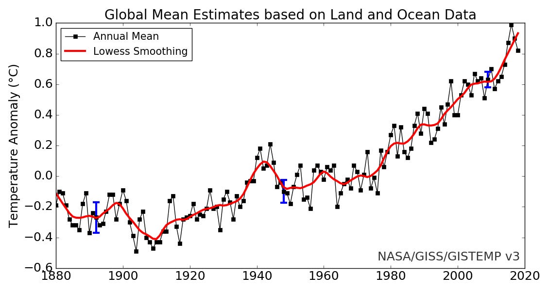
Here is a picture of what they are calling "Global Temperature". It is from NASA (click Global Annual Mean Surface Air Temperature Change on this page).
Quoting: "Land-ocean temperature index, 1880 to present, with base period 1951-1980. The solid black line is the global annual mean and the solid red line is the five-year lowess smooth. The blue uncertainty bars (95% confidence limit) account only for incomplete spatial sampling. [This is an update of Fig. 9a in Hansen et al. (2010).]"
What a lovely example of how to generate massive over-certainty in just one picture! Yes, sir. You too can generate your own massive over-certainty if you just follow the steps the makers of this graph used.
1. Replace Your Data With A Model.
The red line is not the data. The red line is not real. The red line did not happen. The red line is not being used to make a prediction for (as of this writing, since the graph is automatically redrawn yearly) 2021. So why is it there?
To cover up what happened in an attempt to make changes in what happened seem more certain than they really are. This was certainly not done for any nefarious reasons: they are not trying to trick you. This is just what scientists do. They are inveterate modelers. Models, to them, are realer than Reality in some essential sense.
Notice what happened in your mind when you first saw the picture: "Looks like their theory about global warming is true. That red line goes up." Lacking any other theory of temperature change, the certainty you put into scientific pronouncements is therefore stronger than it would have been absent the red line.
There are more theories, though. Another theory, and a sound one, is "natural change." As in, "Looks like 2020 was colder than 2019. I wonder what did that?"
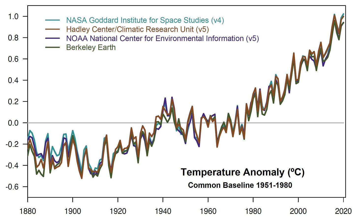
Well you might wonder, because here is another picture, also from NASA, but by another group. From a page with the headline "2020 Tied for Warmest Year on Record, NASA Analysis Shows".
So, which is it? 2020 is colder than 2019 or the hottest "on record"?
That, incidentally, is another way to pile up over-certainty, because the period over which records can be kept is quite short, which makes it likely they can be broken more easily than very long records.
There are also several lines here, which signal a kind of intellectual agreement. "They must be right," you think, "because they all say the same thing."
And they should, since they're all using the same techniques and the same data, more or less. Would you be more certain in the graph if you took their code, ran it yourself, and added your line? "Now there are five agreements!"
However, that is a minor technique next to...
2. Hide The Real Model.
As far as historians tell us, 1880 was a fine year. In a marvelous coincidence, it was the first year Science was published. The optimism for the future and the wonders science would bring was palpable.
Times change.
For instance, there were in the world not nearly as many thermometers as there are now; indeed, only a fraction. And they were of a different kind, or rather kinds, than we now have, especially at sea. Meaning if you set the range of old fashioned ones, next to the range of newer ones, in the same spot, you'd see a range of measurements, some of them perhaps a degree C different.
Another difference: the timing of measurements wasn't the same. Many, many fewer then as now.
And the grandpappy of them all, the hugest of hugeous over-certainties, leaving the other over-certainties to boast of their relative skinniness, the locations of measurements were largely not the same.
See what that means? Do you? It means that the dot for 1880 is not the same as the dot for 2020. It means the dot for 1880 is a prediction of the dot for 2020 (or vice versa).
The average of all measurements (however defined) in 1880 just can't stand in for the average of all measurements in 2020, not without some whopping plus-or-minuses attached to the 1880 average. Where are they?
Think: each dot is supposed to represent some kind of global average, whatever that might be. Go out into your yard or street and walk around. The temperature will likely change as you do, and by quite a lot if you live in a place that isn't homogeneous. Now imagine doing this for the entire surface of the earth (or rather just above it). Everywhere. All at once. (Many times.) The number you get from averaging all this is going to be different than the dot shown for 2020.
How different? I don't know, and neither do you.
So not only is the 1880 dot a prediction for 2020, both dots are predictions for the real average, which, of course, is impossible to know. Yes, even if you used a satellite. Because satellite-derived temperatures are themselves model derived (an inverse formula of some complexity, a function of the light they receive), and anyway you can't do the entire surface of the earth at once either (clouds, etc.).
Which brings us to...
3. Use The Wrong Plus Or Minus.
I talk about this one to exhaustion, but it's very rare I can get anybody to understand me, especially if they have had previous statistical training.
If we want to quantify the uncertainty of how the 1880 point is a prediction of 2020 (the points that went into 2020, not the globe!), we need a model. All models say what they are told to say, and some say right or reasonable things, while others do not.
The loess model above is useless if it just uses the points we see, because it does nothing more than replace the data with a model, the Deadly Sin of Reification. This model says the wrong thing.
But if that model was using, in some fashion, all the data points that go into each yearly point, it might be saying something reasonable. Then that model could be a prediction for (points for) 2020. Which this surely was not. But let that pass, and let's assume that's what they intended.
With that generous (and surely wrong) assumption, we can interpret the blue vertical lines, which are intended as plus-or-minuses. They are the wrong ones. Even if this is the right model.
They are the plus-or-minus of the model parameters, of little chunks of math <em>inside</em> the model. These no one in the world cares about; or, rather, since scientists love parameters even more than grants, no one should care about.
What we want is the predictive plus-or-minus. And that bound is usually four to eight times as wide as the parametric bound normally presented. The blue plus-or-minus is about 0.2 C. Which means the predictive bound is likely to be 0.8 to 1.6 C!
And that is just the predictive bound for the temperature as represented by the point called 2020. Not the real global average, which nobody knows.
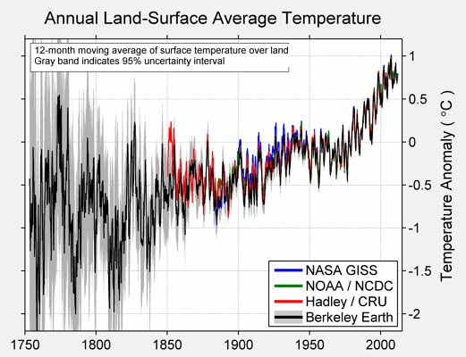
Here's a picture from a group that is aiming toward the right path, but isn't yet on it.


This is Berkeley Earth's BEST, one of the contributors to the second graph above. It goes back further in time than the others, where the sources and locations of temperature measurements are even more different than in 1880.
Those gray plus-or-minuses are nice to see, but, alas, they are also parametric. They are too narrow. Here's an old analysis of their method which goes into the details (not light reading).
Even so, let's take their plus-and-minus seriously. Look at 1750. So (appropriately) wide are plus-and-minus they don't even fit on the graph. In other words, we can't tell with any reasonable certainty whether 1750 was warmer or colder than the points that represent 2000-whatever (it's not clear what the final year is on that chart).
I emphasize: the points that represent 2000-whatever. Because it's not the global average, which again nobody knows. Shall I repeat that? Nobody knows.
BEST (the name of the Berkeley project) didn't understand they had to do the same thing for points after 1850, and up to whenever date the methods and locations for the latter points stopped and never changed.
Which they didn't. Stop, I mean. All these things are ever in flux. Which means every point should have predictive plus-or-minuses around them.
Which sort of brings us to our last tip, which is to...
4. Be Selective In What You Show
The whole political point of global cooling, a.k.a. global warming, a.k.a. climate change, a.k. climate emergency, is that temperatures (etc.) we are now experiencing, or soon will experience, are worse than ever. And that Experts, scientists, and rulers know the exact climate optimum; i.e. the best temperatures, precipitation, both rain and snow, sunshine, humidity, and so on, at every point on the earth and under the water. These are some smart guys!
Even so, it's of interest what temperatures (etc.) were before in history. Why start the graph at 1880? History is longer than that.
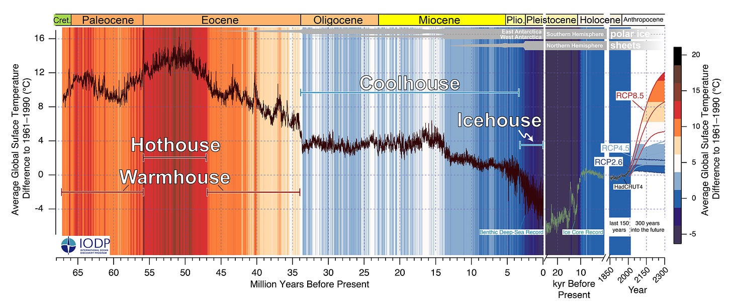
Why not start, say, at 6,000 BC? Or 20 million BC (or whatever the name of that movie was)? Here's one chart (from another approved source) that attempts to do so:
You'll notice the chart makers followed all our tips (except of course this last one) and generated massive over-certainty. Kudos to them. But at least they went back before 1850. Sort of. There's an odd lacuna at that date. They just gave up?
Anyway, you have to love how they gift us two new over-certainty generating ideas. The first was to label points in history "Coolhouse" which were much warmer than they are now, accepting the plot as true. But they still managed to make the viewer sweat over global warming. Magnificent.
Also, from about 5 to 10 thousand years ago, it was again much hotter than now. A time when man thrived. But not on burning fossil fuels. Meaning it was hotter then than now for other reasons. Reasons that still might exist. Interesting, no?
Their second method was to plot the most panicked predictions of future 2020-like points (and not actual global means, which again nobody knows). This makes a terrific contrast to the historical data. Scary!
Until you ask yourself, how in the hell can they be that certain of what the temperature will be, when they aren't even that close to certain what the temperature was?
That is when you begin laughing.
Question & Answer Period
"You can't be right, Briggs, because Experts disagree with you."
Are you a reporter, or maybe an activist?
"What's the difference what the real global mean is. I see that nobody can know it. But they still pick some points, and methods, and functionally declare that to be the global mean temperature, or GAT. In fact, I remember you saying you could do this yourself, years ago."
You're right. I did, and they can. This functional GAT can be tracked, modeled, and toyed with, like any other scientific measurement.
But then you have to prove it means something to me. That is, how is a small change in functional GAT, given the hugeous changes we've seen in history, going to affect me? And the guy down the street? And so on?
I can barely feel a 1 C change, so functional GAT change alone is of little meaning. So it has to be things changed by changing GAT. And of those secondary changes, and the tertiary after adding in "solutions" to bring us to that Expert-known optimum, we are necessarily even less certain. Here we enter the Multiplication Of Uncertainties, where the string of propositions you center around functional GAT itself (the string I mean) grows rapidly uncertain and improbable.
"It's me again. You can't be right because otherwise why would so many people, even some very smart ones, be so worried and assured they are right? Besides, even if they are wrong, isn't it better to do something?"
I can be right. And, no, it isn't. How do you know what you will do won't make things worse? Answer: you cannot.
Buy my new book and learn to argue against the regime: Everything You Believe Is Wrong.
Visit wmbriggs.com.


