Vax Has Slight But Waning Edge In Old But Harms The Young
You know I rarely ask, but please spread this post far and wide. It's important.
Berenson's Post
Many are asking about deaths rates in the vaxxed and unvaxxed in England, because of a post by Berenson.
The deaths rates by vaxxed and unvaxxed depend on age. The vax has some waning efficacy for the old, but it's not good for the young. Let's see the details.
The source is ONS. Berenson's only graph in that post is this:
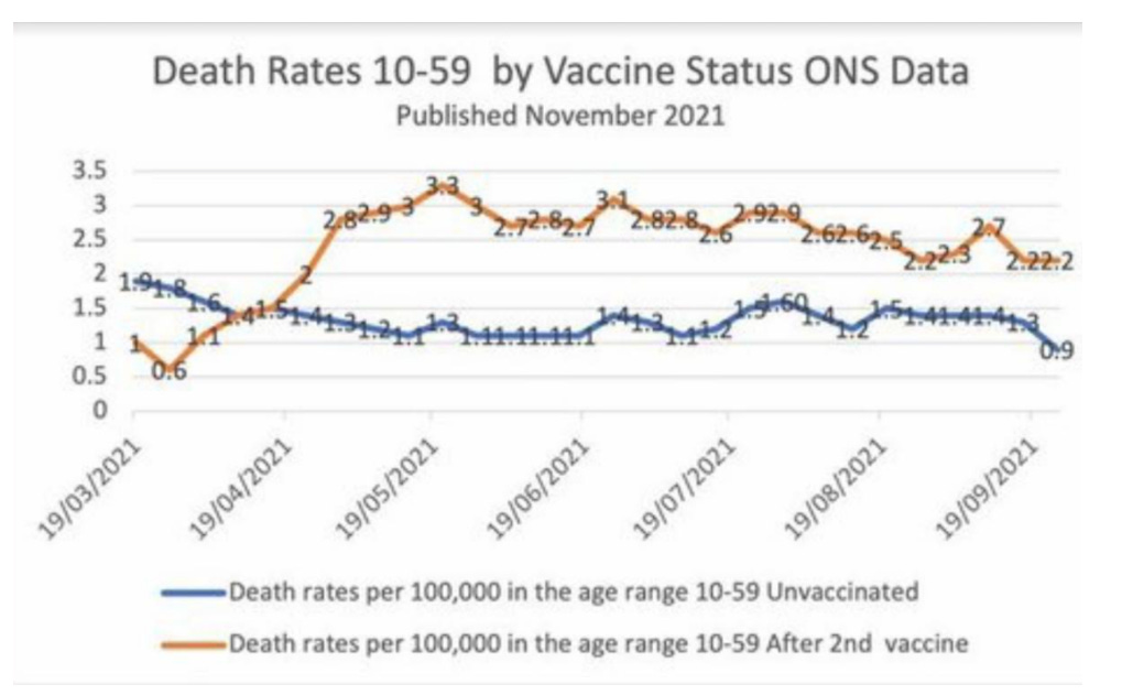
He says:
The brown line represents weekly deaths from all causes of vaccinated people aged 10-59, per 100,000 people.
The blue line represents weekly deaths from all causes of unvaccinated people per 100,000 in the same age range....
I have checked the underlying dataset myself and this graph is correct...
I don’t know how to explain this other than vaccine-caused mortality.
Alas, there is an error here caused by lumping all the data together. We'll see below that the death rate for unvaxxed is higher than for the two-shot ("fully") vaxxed---in all but the young, where the rates reverse.
This is both modest and horrible news. Again, let's see why.
Death Rates by Vax Status and Age
The data is richer than Berenson shows, and is presented by ONS in four age buckets ("10-59" "60-69" "70-79" "80+") and four vax status buckets ("Unvaccinated", "Within 21 days of first dose", "21 days or more after first dose", "Second dose"). It's most unfortunate they don't break the young out separately.
The data runs from January through the end of September 2021 (October and November are missing). The data are weekly number of all cause deaths and the population size of the age and vax group for that week.
Let's look at Berenson's plot reimagined, but we'll use all the data and present each age and vax bucket. Since having all in one plot would be too busy, I produce separate ones for each age bucket. The y-axis is in "scientific notation", wherein e.g. "2e+07" = 20,000,000 (7 zeros), and "6e-05" = 0.00006 (5 decimal points), etc. Note carefully the range changes for each plot.
I think putting rates in terms of 100,000, as both Berenson and ONS did, can be misleading, so I show the actual rates.

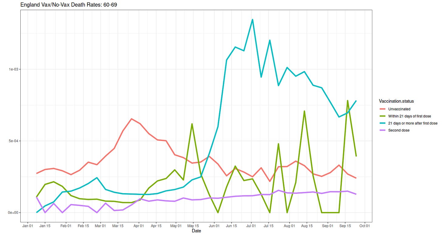
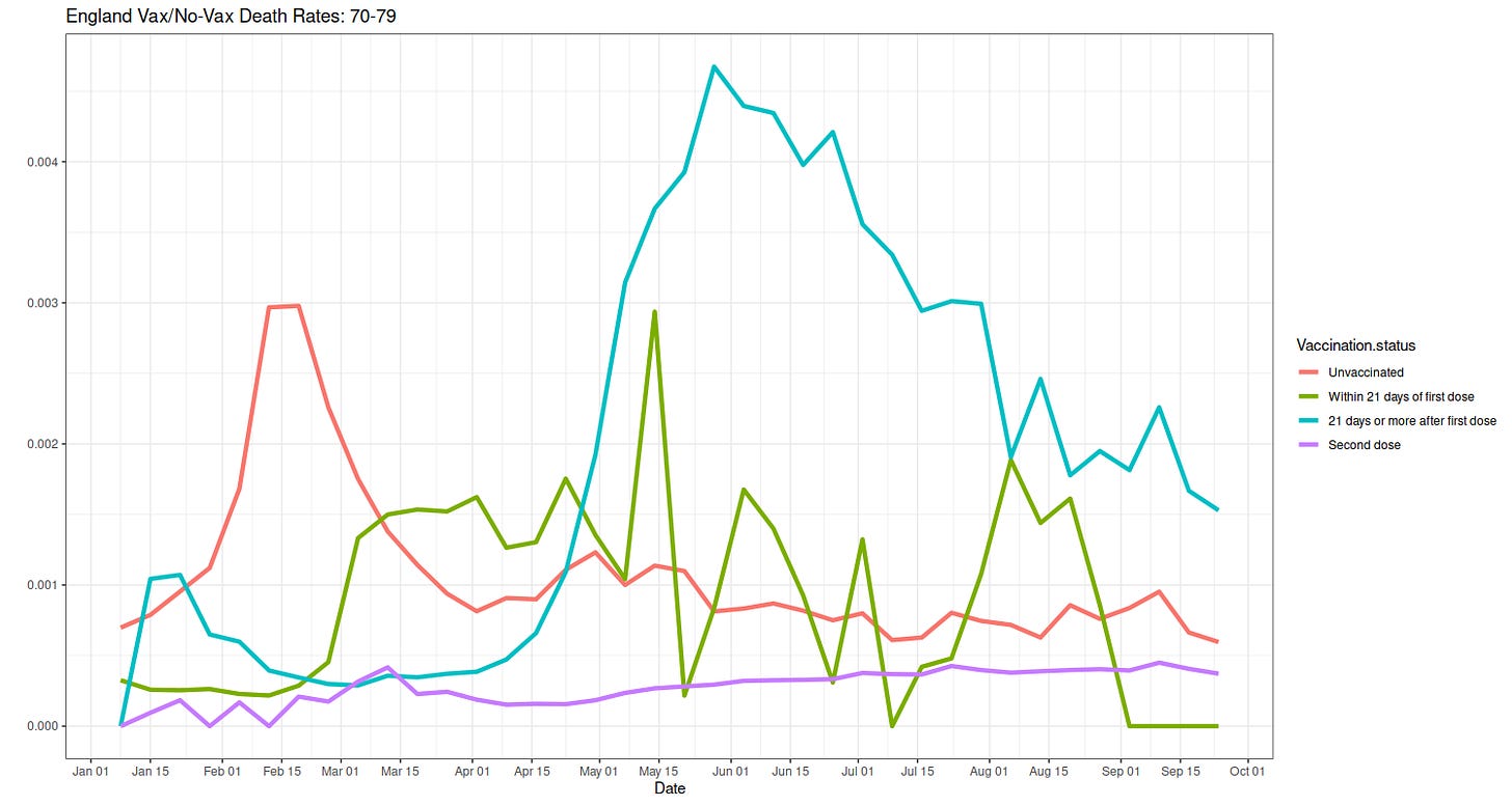
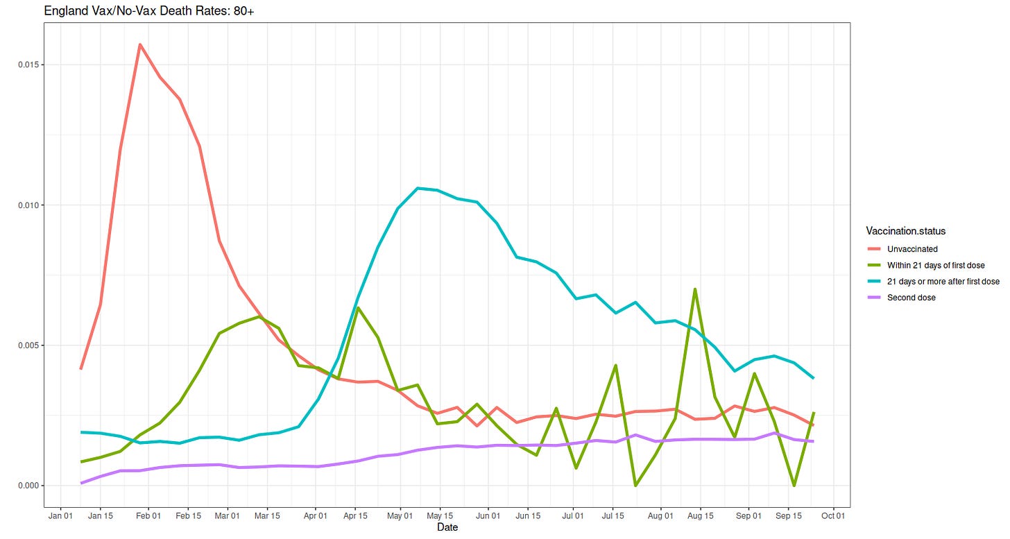
Well, you can see it. The older unvaxxed have higher attributed all cause death rates than the two-shot vaxxed now. Except in the young, where the two-shot vaxxed are worse off. Before we discuss why, here are the populations of each group by age.
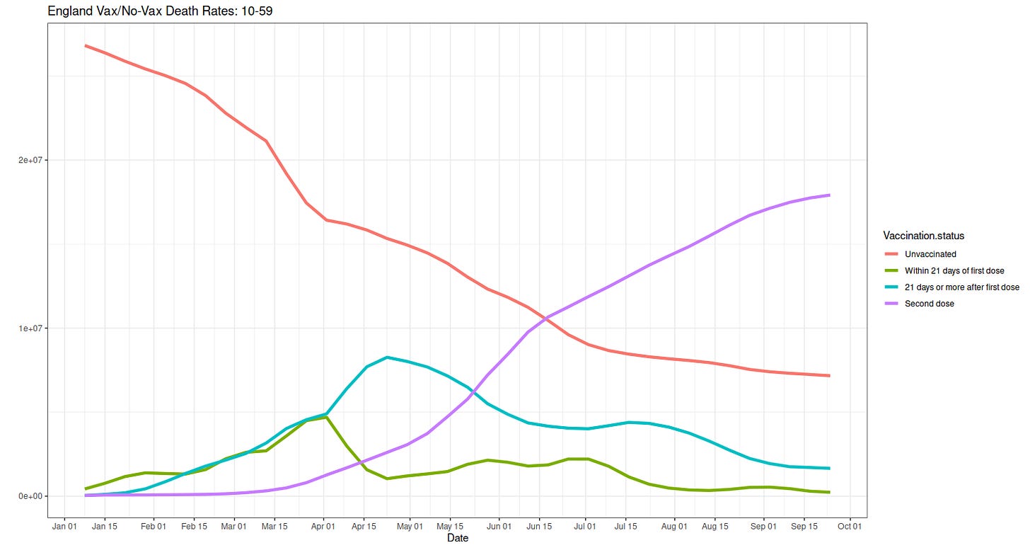
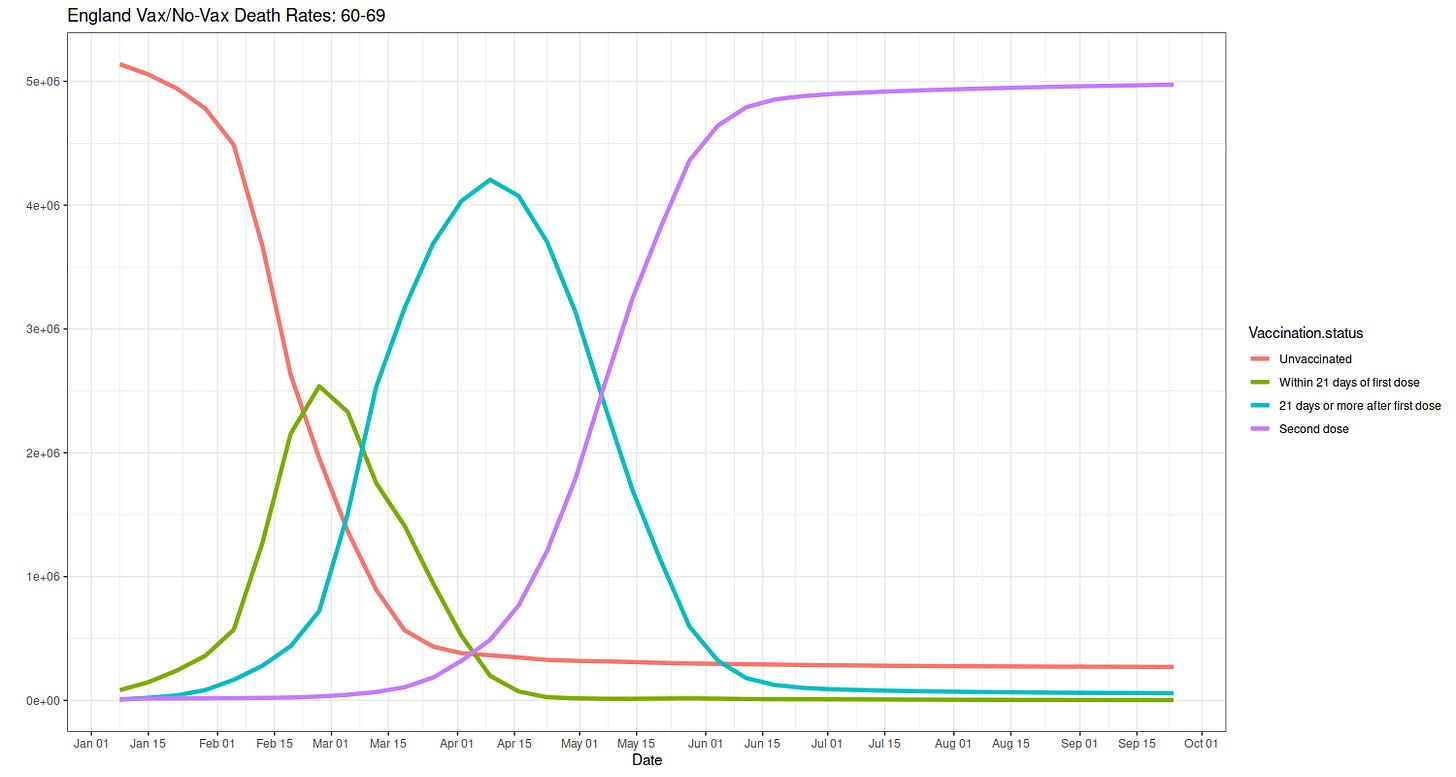
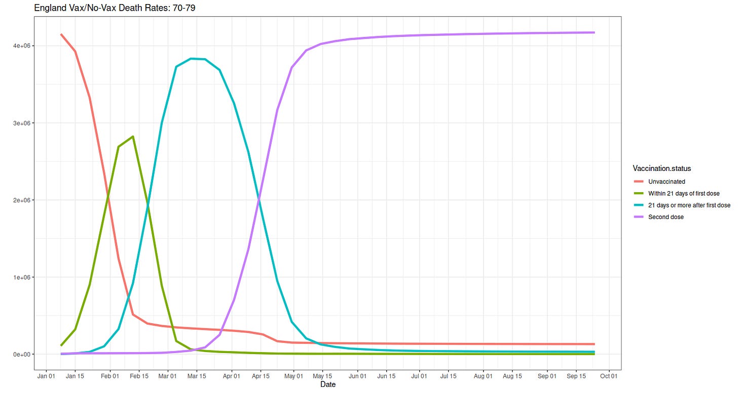
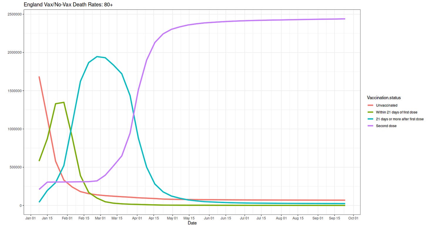
Let's discuss the population sizes first, since it's easier and because it is key.
Start with the oldest group, the 80+, and work backwards. It's very plain the oldest got vaxxed first. The waves of increasing vax status (no vax shrinks, <21 days rises then shrinks, etc.). This starts first in 80+, then 70-79, then 60-69. It's here the limitation of not separating out the young in the 10-59 group first shows, since most under 17-20 or so are not vaxxed, but many 20 and above are.
Anyway, you can clearly see the number of unvaxxed in all but the young is very low, whereas the unvaxxed (necessarily) started out high in each group.
What is key is to recall that people can and some must show up in each vax group at different time periods (unless they stay unvaxxed). That means when considering deaths we have to think about who got vaxxed and when.
It is also plain that vax rates for the older folks have maxed out, and did so months ago. Unless England wants to be like Austria is contemplating, and to ship the unvaxxed to camps where they can concentrate on their unvaxxed status before being invited to large buildings where the vax will be forcibly administered, perhaps in gaseous form. Danke, Herr Schallenberg! More on that tomorrow.
Let's start with the 80+ death rates. The red (unvaxxed) is higher than the purple (two shot), but it appears the gap is closing. This is almost certainly because the powers of the gene therapy treatment, which causes your own body to produce spike proteins, wanes in time. We know this by looking at red-purple differences back in January, where the unvaxxed were dying at much higher rates. But this is also when many of the unvaxxed people started getting shots. That caused an uptick in the purple line (less healthy people getting vaxxed).
But all has been steady since about June. The closing difference at the end has to be caused by something, and the only something available to us are the vaxs' powers.
Now look at the green line, which is "Within 21 days of first dose". The choppiness is because of the small sample size, so don't read too much into it. The shot, back in January, first appears to confer some benefit, but as the weakest move from the unvaxxed into the one shot column, the rates quickly coincide. The rates of the <21 days of the first shot in September, since June, is no different than no shot.
Here's the kicker. That blue line is "21 days or more after first dose", but (of course) still shy of the second shot. It has the worst rates of all!
This backs the arguments people like our friend eugyppius have been making, and the points I have been making since the beginning. Any shot that is purposely designed to weaken you and make your body make you sick, makes you vulnerable. The first shot now seems, as just said, to do almost nothing at first, but then you open yourself up to infection, possibly from a variant, and you have a higher chance of dying from Covid, until you get the second shot.
So if you're getting the first shot, you had better get the second, which appears to confer some benefit, and maybe before the recommended 28 days, else you could be in deep kimchi. Of course, that benefit is not very large---nowhere near the touted rates in the high 90s---and it also wears off in time. You are a little but not much better off than the unvaxxed, except for a time.
The story is exactly the same, but happening later in the time, for 70-79 year olds, and 60-69 year olds, where the danger of waiting after the first shot is relatively the largest.
Let's switch to the youngest, the 10-59 year olds. Again, it's a pity ONS didn't bust this out into, say, 24 and younger and those from 25-59. Because it's almost certainly (we know from our own CDC data) the case that those around 24 or 25, or maybe slightly older, will be just like the other groups.
We have to recall in this graph that many, say, 17 and younger were not vaxxed at all in January, and only increasingly are now. And the young die at lower rates.
Well, it's plain. The unvaxxed have lower death rates than the two-shot vaxxed. The two-shot vaxxed are in as bad a shape as those with just one shot after three weeks.
What's weird is that green line, the early one-shotters, is best (the big jump at the end is due to a small sample size). This is a result of mixing the young, who are in no appreciable danger of Covid, with the relatively older, who have more risk. Careful, now. The people in the denominator, if they don't get the second shot within 21 days, move into the denominator of the blue line.
That means the first shot, even in the young, provides some benefit, but then, after three weeks, things move very quickly south.
Again, there is no evidence here in favor of vaxxing the young indiscriminately (there is always a case for vaxxing kids with certain comorbidities). Indeed, the evidence suggests the opposite: do not vax children en masse.
This is the official data. Surely England's Experts can read it as well as we can, or better. What's their official line on all this?
Bonus 1 Relative Rate Reduction Plots
The post was already long, so I break out the relative risk reduction of the vaxxed to the unvaxxed. The red lines represent no reduction. "Reduction" is a word like "profit", in that it can be negative, i.e. a loss. Meaning the vax can cause harm; this is shown when the "reduction" is negative.
Here they are, and some words after.
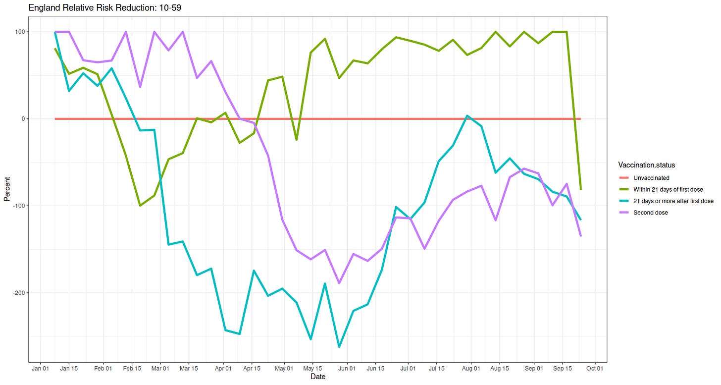
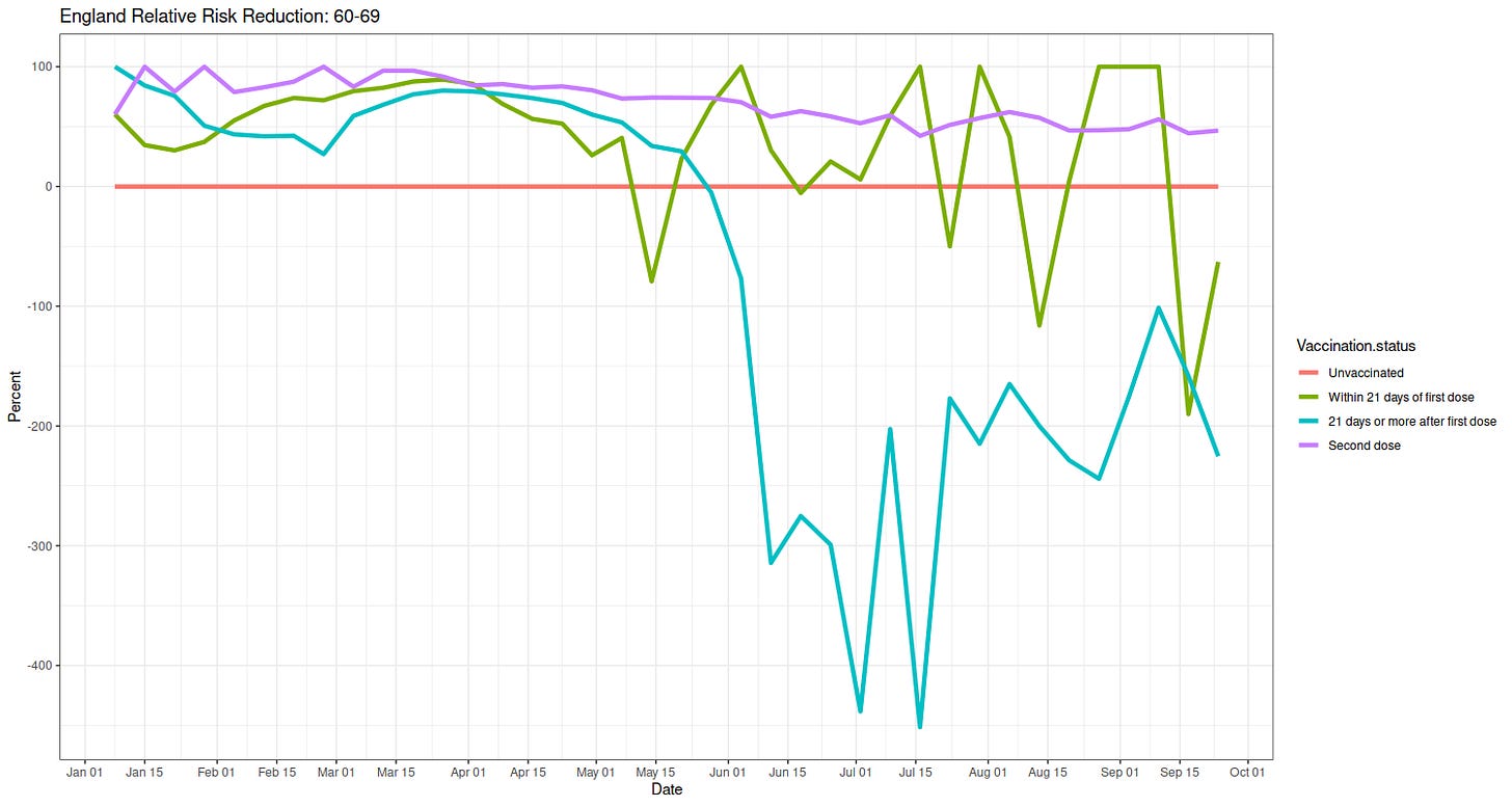
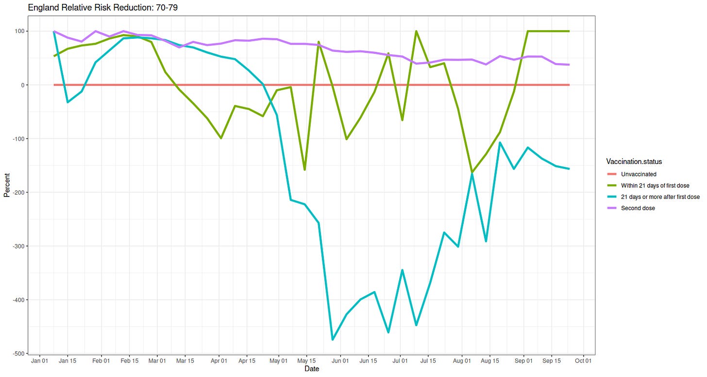
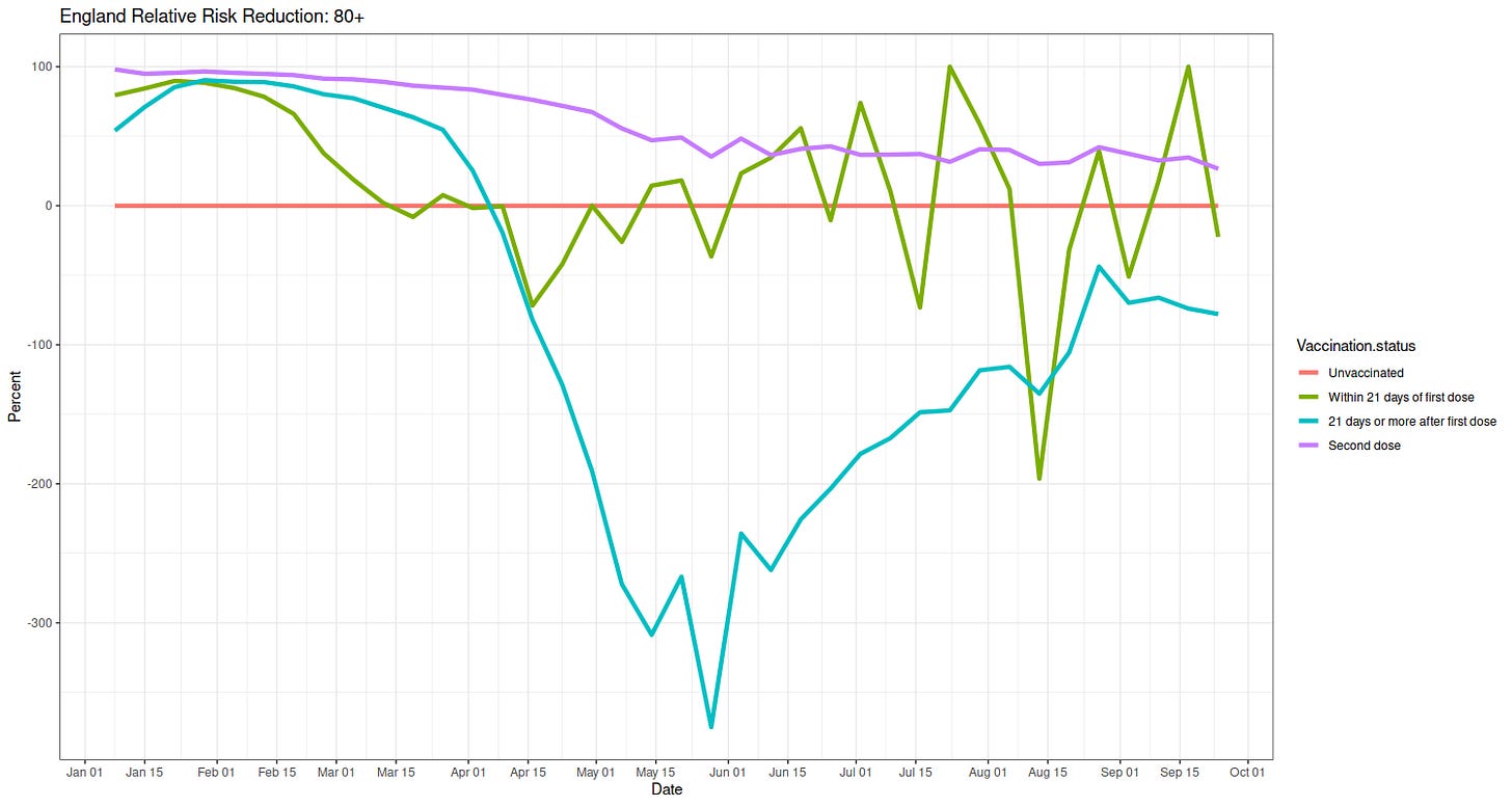
In the youngest group, except for that small number of first shots under three weeks, the vax is worse. Same reasons. The swooping low in late spring is because ONS didn't bust out the young from the older, as explained above.
In the other groups, looking just at the purple, two-shot line, you can easily see the waning efficacy. Down, down she goes. For the 80+, it's now about 25%. Remember when they said it was near 100%? Good times.
The trend in these is clear, as above. Don't vax the young. Vax the old at risk, but don't get too excited about the results. The vax is much worse, four to five times as bad, for the young than it is good for the old.
There is no evidence here that suggests mandating the jab, or forcing it à la Austria, will do anything except bring grief.
Bonus 1 Absolute Rate Reduction Plots
Since relative rates can, and do, exaggerate, and because I love my readers, here are the absolute risk reductions. These are the numbers that should, but alas are usually not, of interest to public health. They are the numbers that best predict what will happen, whereas the relative ones (again) exaggerate.
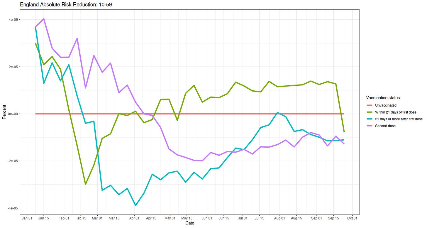
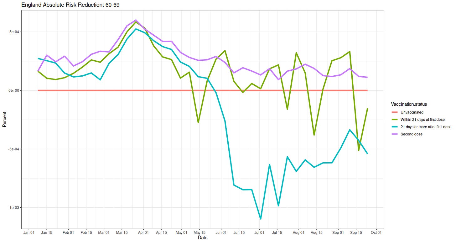
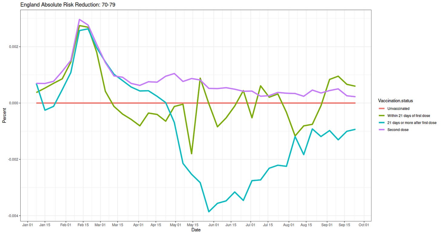
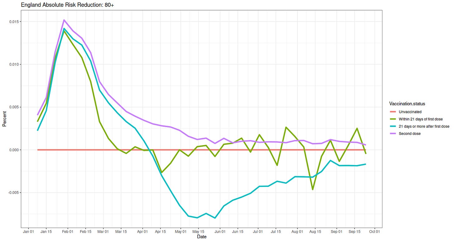
You can figure these out by yourself at this point. As far as public health goes, i.e. medical decisions for large groups of people, there is no support here for mandates---look at the absolute differences for the old---and even much evidence mandates will do much harm---same for the young.
Buy my new book and own your enemies: Everything You Believe Is Wrong.
Subscribe or donate to support this site and its wholly independent host using credit card or PayPal click here


