CDC Flashes Its Wee P At Us In Thin Effort To Uphold The Cult of the Mask: Coronavirus Update LVI
EXPERTS FLASH THEIR WEE P
Masks are the uniform of the effeminate.
You'll have heard by now of CDC's latest mask study, in which grown experts flash their wee p-values at us and present findings that can only be seen under a microscope.
Here's the study link. Description:
To examine the association of state-issued mask mandates and allowing on-premises restaurant dining with COVID-19 cases and deaths during March 1--December 31, 2020, county-level data on mask mandates and restaurant reopenings were compared with county-level changes in COVID-19 case and death growth rates relative to the mandate implementation and reopening dates.
So they ignore the January peak and subsequent dramatic fall, which is seen below. A cynic would say because those numbers aren't helpful to their thesis, but a Mask Cultist would cry "late data!" He'd have a point, but it's weak because we know deaths begin to drop every middle January.
The immediate problem is population-heavy counties differ in all sorts of ways surely causally related to coronadoom health from scantly populated counties. Like age, fitness, fatness, access to quality physicians (and not the increasing number of quacks), and so on. The biggest is probably compliance rates.
Difficult to measure all this, so I'm on their side. But since we know these differences exist, we have to mentally add a certain plus-or-minus to the results, regardless what wee p-values say.
First results:
During March 1--December 31, 2020, state-issued mask mandates applied in 2,313 (73.6%) of the 3,142 U.S. counties. Mask mandates were associated with a 0.5 percentage point decrease (p = 0.02) in daily COVID-19 case growth rates 1--20 days after implementation and decreases of 1.1, 1.5, 1.7, and 1.8 percentage points 21--40, 41--60, 61--80, and 81--100 days, respectively, after implementation (p<0.01 for all) (Table 1) (Figure). Mask mandates were associated with a 0.7 percentage point decrease (p = 0.03) in daily COVID-19 death growth rates 1--20 days after implementation and decreases of 1.0, 1.4, 1.6, and 1.9 percentage points 21--40, 41--60, 61--80, and 81--100 days, respectively, after implementation (p<0.01 for all). Daily case and death growth rates before implementation of mask mandates were not statistically different from the reference period.
Using changes in rates of change is the wrong measure. They should have used changes in per capita actual rates. Can any one in class say why?
Anyone? Anyone?
Because the smaller the county, those less likely to have high compliance or mandates (in flyover places like South Dakota), the easier it is to have a large change in rates! Small samples are more variable. And this was the time of the very expected ramp up in testing. Meaning we know the rates were going to increase everywhere, and that larger changes would happen in smaller counties.
Besides, these are not increases in "cases", which even the CDC now misidentifies. These are positive tests, not cases. How did we get so bad at this so fast?
"But how did they do the stats, Briggs? I see they use wee Ps to claim causation, which I know is anathema to you."
Yes. Every researcher when pressed says using statistics insists correlation isn't causation, until it comes to his data, when that principle is inverted. He flashes his wee p-value at you and says "Eat this! I've proved my cause!"
Anyway, here's the (rancid) meat (I've removed all footnote indicators):
Weighted least-squares regression with county and day fixed effects was used to compare COVID-19 case and death growth rates before and after 1) implementing mask mandates and 2) allowing on-premises dining at restaurants. Because state-issued policies often applied to specific counties, particularly when states began allowing on-premises dining, all analyses were conducted at the county level. Four regression models were used to assess the association between each policy and each COVID-19 outcome. The regression models controlled for several covariates: restaurant closures in the mask mandate models and mask mandates in the restaurant reopening models, as well as bar closures, stay-at-home orders, bans on gatherings of ≥10 persons, daily COVID-19 tests per 100,000 persons, county, and time (day). P-values <0.05 were considered statistically significant. All analyses were weighted by county population with standard errors robust to heteroscedasticity and clustered by state
Good grief. We don't see data, but the mixed results of a slew of weighted regression models. We are as far from the data as the ACLU is to recognizing men who claim to be women aren't women.
They repeat the above with changes in rates of rates of attributed deaths, coming to similar numbers.
Which is to say, numbers down in the "noise."
"Come on, Briggs, you hypocrite. You always warn us about using terms like noise."
True. Yet the biggest claim they make regarding deaths is "1.9 percentage points", which is surely in the room for error given the causal effects not measured but which we agreed are there.
And don't forget, these are parametric not predictive estimates. Meaning, almost certainly, the predictive estimates would show no effect. It's easy as getting as BA in Communications to get a wee p-value out of thousands of data points.
UNMASKED DATA
Again we ask ourselves, if masks work, then why don't masks work?
Most of us saw the panic over Texas returning to liberty. But don't forget many Texans, especially outside cities, were mask scofflaws. Other states have since followed Texas, but also recall some states never panicked.
Here, using the COVID Tracking Data, are the attributed coronadoom deaths per capita (drop off at end due to late collections). The left column are states that panicked, the right column are states that did not panic, or panic as much, with mask mandates etc. (Texas officially panicked.)
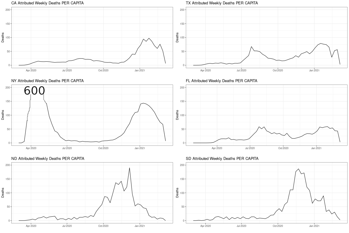
I had to cut NY off at 200, which peaked at 600 because The Godmother, who not only panicked but panicked arrogantly, killed all those old people.
You cannot draw from this plot any story about masks working. Or about how panics saved lives. Panic only costs lives.
LA (Source):
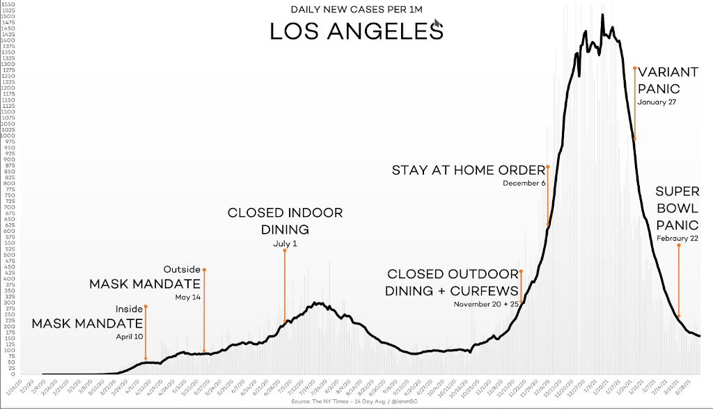
This one isn't as good, because it includes Texas as a no-mask state, which it is now, but only just was. And it uses smoothing, which is not the data. I show it as an example of how not to do it. Never smooth and then analyze without at least carrying the uncertainty of the smoothing through.
https://twitter.com/wesbury/status/1367915200784052230
This is much better:
https://twitter.com/justin_hart/status/1368195448100380675
The only thing this lacks is mask use by locality, and attributed deaths. NYC, the city I know best, has usage well above 90%, usually 95%+, and it's been that way since the summer (source).
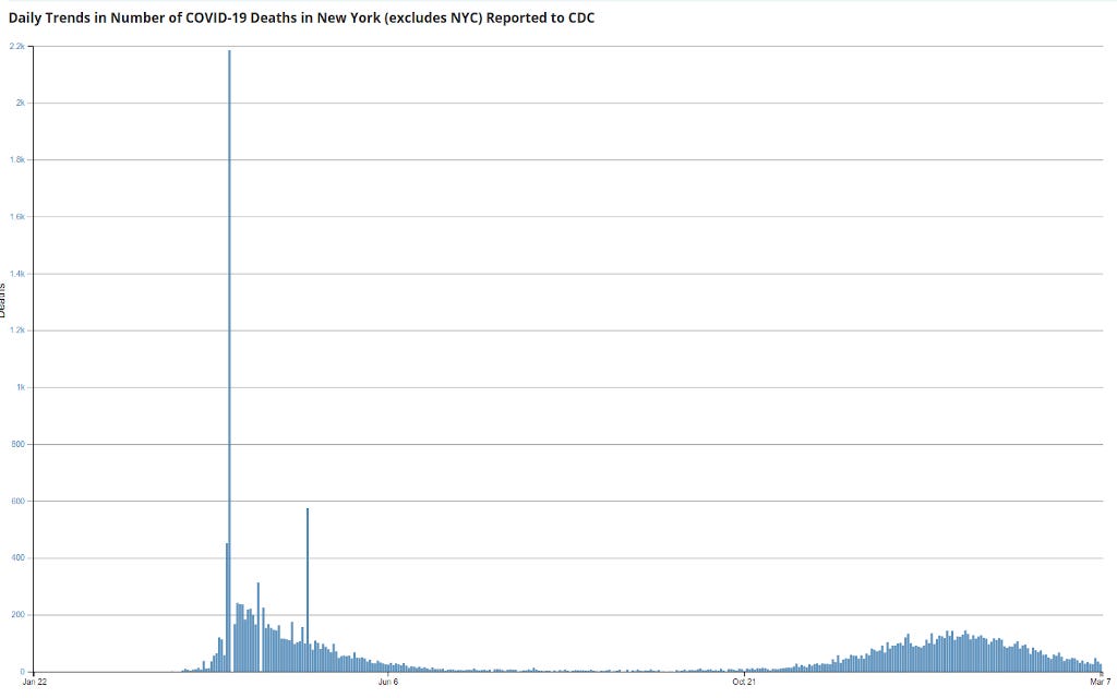
Mask use did not prevent the winter spike. How could this be if masks work?
https://twitter.com/justin_hart/status/1367700143592464385
Some of those are in the link I provide at the bottom of this post. Masks have never been shown to work.
You know who agrees? WHO.
That's what I'm asking. Who?
Exactly.
https://twitter.com/DrJayRichards/status/1361815813246898176
BOOK
https://twitter.com/RustBeltKid13/status/1367546617205837828
Website of similar name: price of panic.
THE NUMBERS
Sources: daily tests, CDC official toll number one, number two (the old weekly file, now suspect). Deaths by age. Covid & flu. WHO flu tracker. All current as of Monday night.
Daily tests:
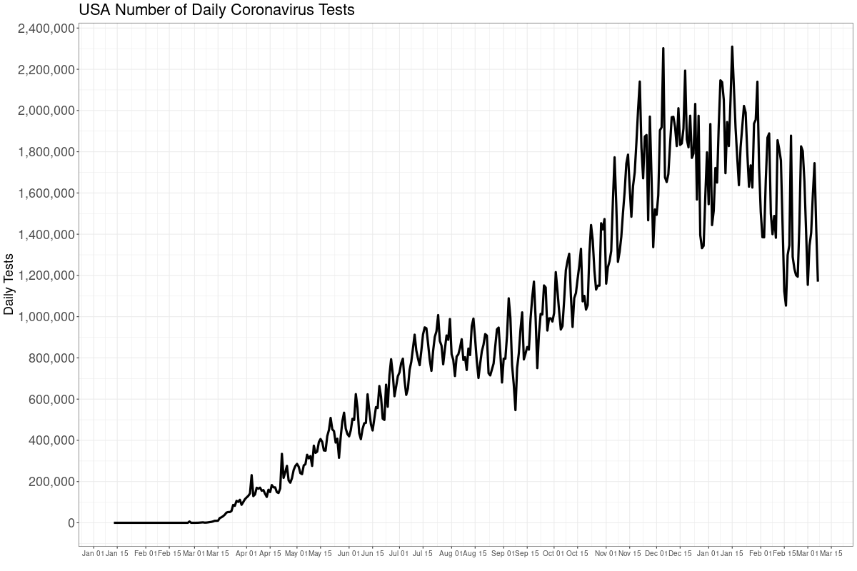
Tests are dropping, but the rate of decrease slowed a bit. The CDC and others tried to gin the panic on "variants" these past two weeks, and that likely accounts for some of the slow in rate. The "variants" themselves might account for part, too.
Every positive test the media falsely calls a "case", when it is only an infection with varying degrees of seriousness---and most are not serious. The media really does not know how to tell the truth.
Positivity rate of the tests.
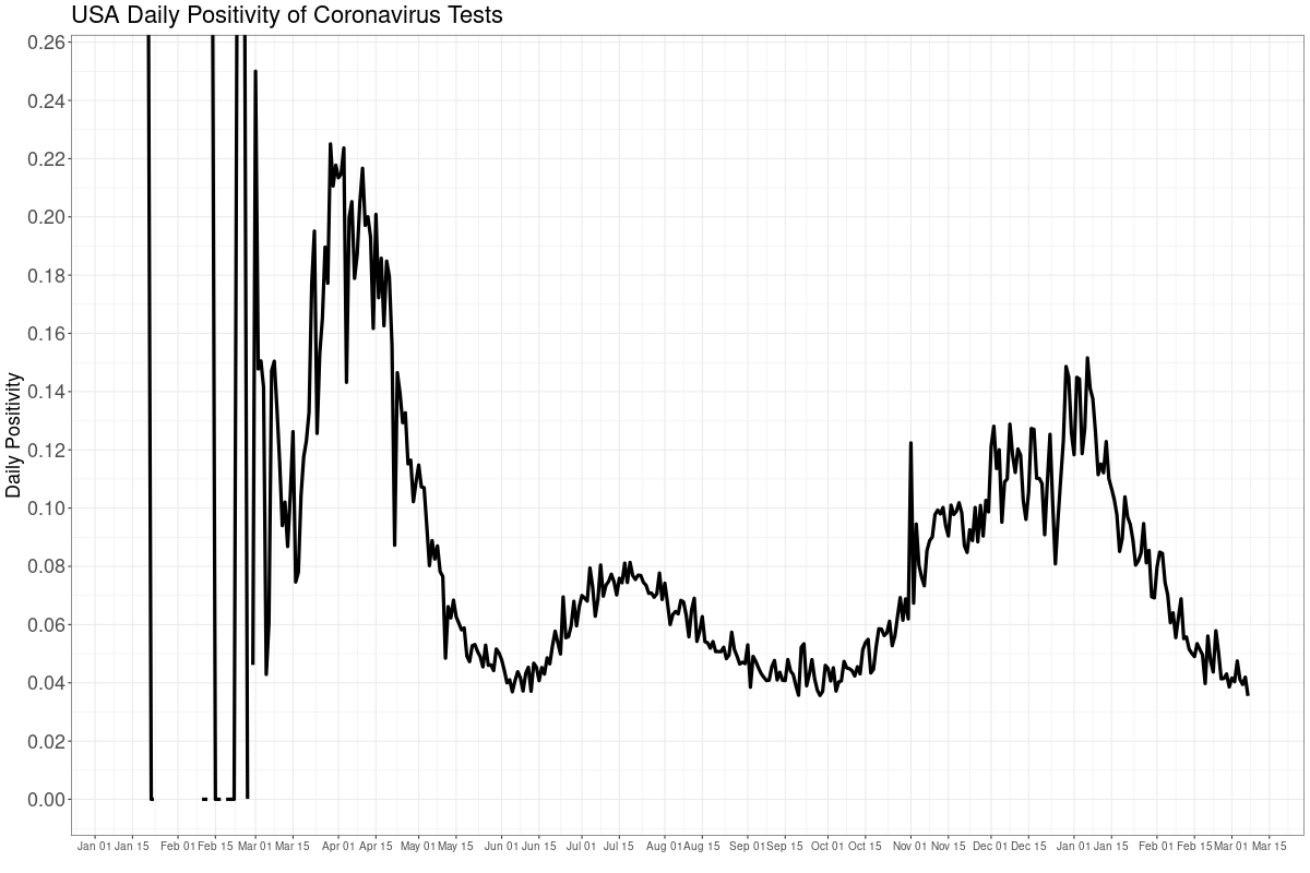
Notice carefully that this is not dropping because tests are dropping. If anything, and all things equal, fewer tests mean larger positivities, because it's more likely only the sickest are being tested.
The rate flattened a bit here too, and likely because of those "variants".
CDC weekly ALL CAUSE death counts, or the Perspective Plot, from late 2009 until now. The late drop off is late counting: it takes up to eight weeks to get all data. We need to look at all cause deaths because we can't quite trust the attributed COVID numbers.
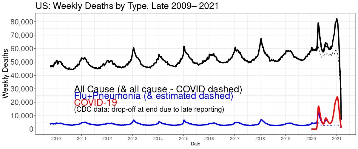
The black line is deaths of any kind. The red is COVID. The blue line is flu+pneumonia (it's the pneumonia that kills most flu patients). The blue is estimated starting mid year 2020 because CDC stopped separate reporting on flu. The suspicion is some flu and pneumonia deaths are being attributed to COVID.
The numbers are dropping like lobbyist donations to Nancy Pelosi. Maybe even faster, which we'll see in a moment.
Here is the CDC deaths "involving" COVID.
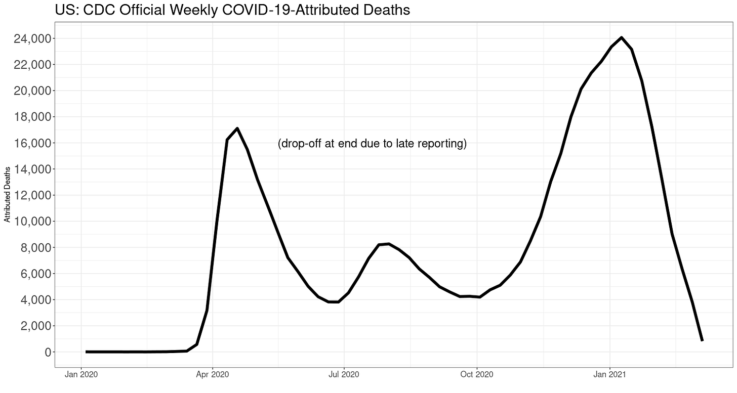
See any reason to panic?
Here is another way to look at all deaths, the week-of-the-year all-cause deaths. This one tells the real story.
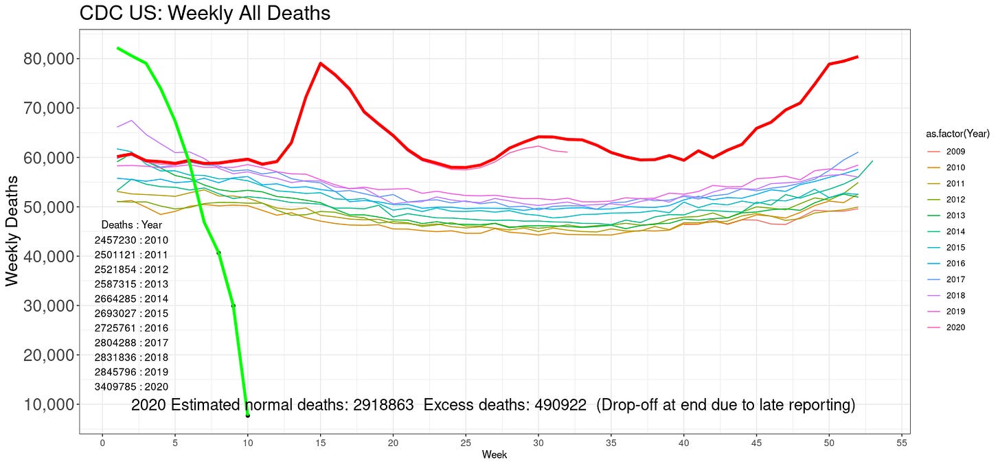
Dude. This is astonishing. You can see the black dots on the green line, which indicate the late counts. But before that, even with some late counts coming in, this is low. Real low. There simply is no crisis left. None.
Yet, of course, the coronavirus will be with us forever, as flu is.
The 2020 estimated "excess" deaths (using my extrapolation model) are closing in. About 490 thousand. Rose 3,000 since last week. It's about topped out. I won't report on this next week, but I'll leave it in the chart.
MOST IMPORTANT: these are not all COVID deaths! They include deaths from the "solution" to COVID, too. Plus increased suicides, septicemia and other iatrogenic kills, cancers, heart attacks, and everything else due to lockdowns. Like car crashes, as we saw above. Plus, there were over 80,000 drug overdose deaths last year. This point cannot be over-emphasized.
Flu is still missing. Here is the WHO's global flu tracker, which still shows flu has gone missing everywhere:
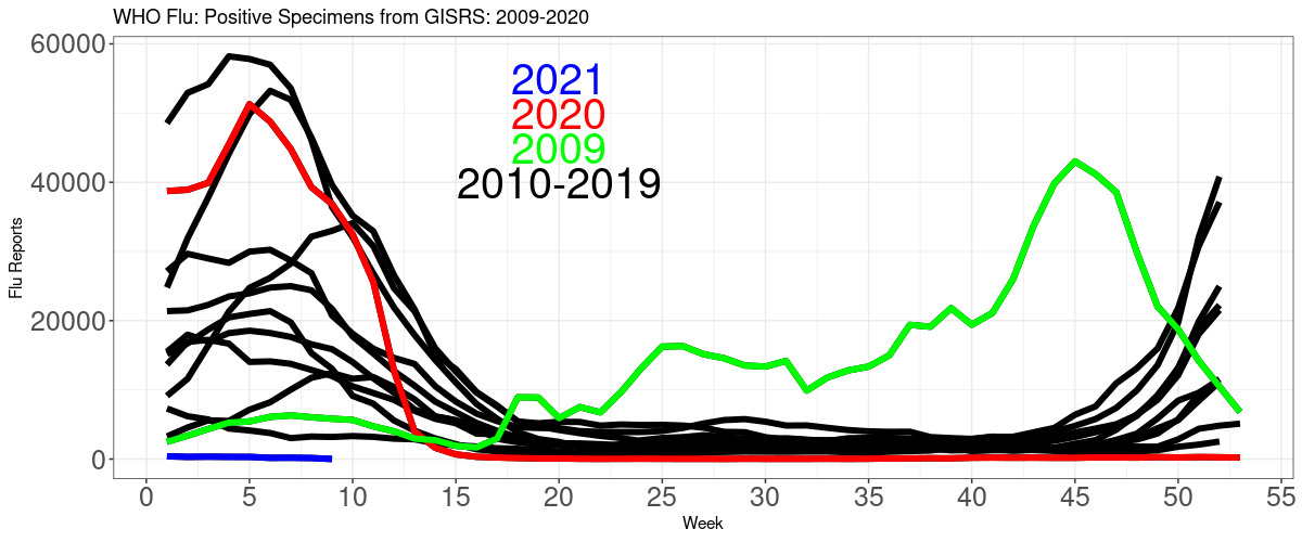
Flu is still gone the whole world over.
Here is the CDC official population mortality rates for the all causes other than COVID, and "involving" COVID (with and of; "involving" is CDC's word).
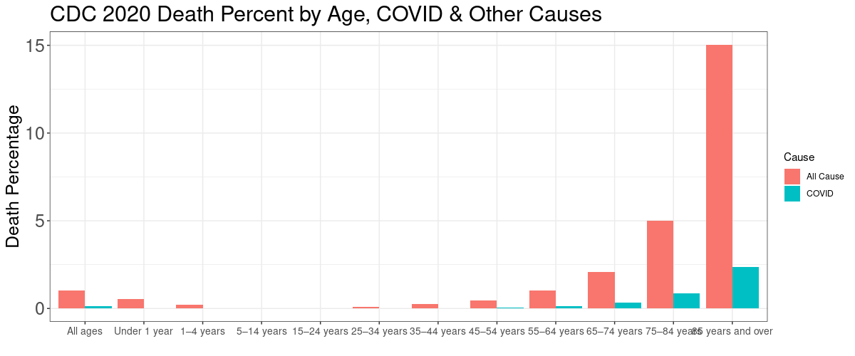
POPULATION FATALITY RATES
                 Age      COVID OtherCause
1       Under 1 year 0.00001200   0.005400
2          1–4 years 0.00001300   0.002300
3         5–14 years 0.00000061   0.000091
4        15–24 years 0.00000180   0.000140
5        25–34 years 0.00001500   0.000830
6        35–44 years 0.00020000   0.002600
7        45–54 years 0.00056000   0.004700
8        55–64 years 0.00140000   0.010000
9        65–74 years 0.00340000   0.021000
10       75–84 years 0.00860000   0.050000
11 85 years and over 0.02300000   0.150000
I say this every week, too: No matter what age, there is at least about a 10 times or larger chance of dying from something else then COVID. If you're under 44, the COVID risk is tiny. Our level of fear is in not in line with the actual risk for the majority of the population.
About masks in depth, see this article and this one. I am also working on a comprehensive article about masks. Hint: they do not work.
To support this site and its wholly independent host using credit card or PayPal (in any amount) click here


